When we meet with potential clients that have approached us about designing an addition / renovation or a new home, one of the earliest, and most understandable, questions is about cost - both construction cost and the cost of our design services.
They are fair questions, and the answers are more nuanced than project size or level of finish. In this post we will discuss the cost and value of High-End Architectural Design services.
When you invest in high-end residential design, you are not simply paying for drawings that will allow you to get a building permit and something that the builder can use to build. You are investing in expertise, foresight, precision and a level of care that protects both a thoughtful design vision and your capital based on more than 30 years of experience in high-end residential design.
Here is what you are truly paying for. . .
1. Vision Refined by Experience
Luxury design is not about experimentation. It is expertise applied thoughtfully to your specific project.
Behind every line we draw are decades of collective experience—projects completed, lessons learned, details refined, construction challenges solved. We know where projects tend to falter, where budgets can erode, and where shortcuts become expensive regrets.
That experience allows us to anticipate problems before they arise which prevent costly mistakes during construction.
This is why we do not pass off our projects to “Project Architects”. Although our staff is fantastic, one of our Principals manage every project in our office. In this way, our clients benefit from our vast experience and your project is not managed by someone with significantly less exposure to residential design and construction.
2. A Deeply Personal Design Process
No two clients live the same way. True luxury is not about replicating a style; it is about creating a home that feels unique and specific.
Our process involves immersive discovery—understanding how you entertain, how you unwind, how your family gathers, how you move through a space without thinking. We study sightlines, light patterns, circulation, privacy, and architectural sequencing as you move through a space.
This level of customization requires time, iteration, and thoughtful collaboration.
You are paying for a home designed around you—not adapted from a template of past projects and churned out “typical” details.
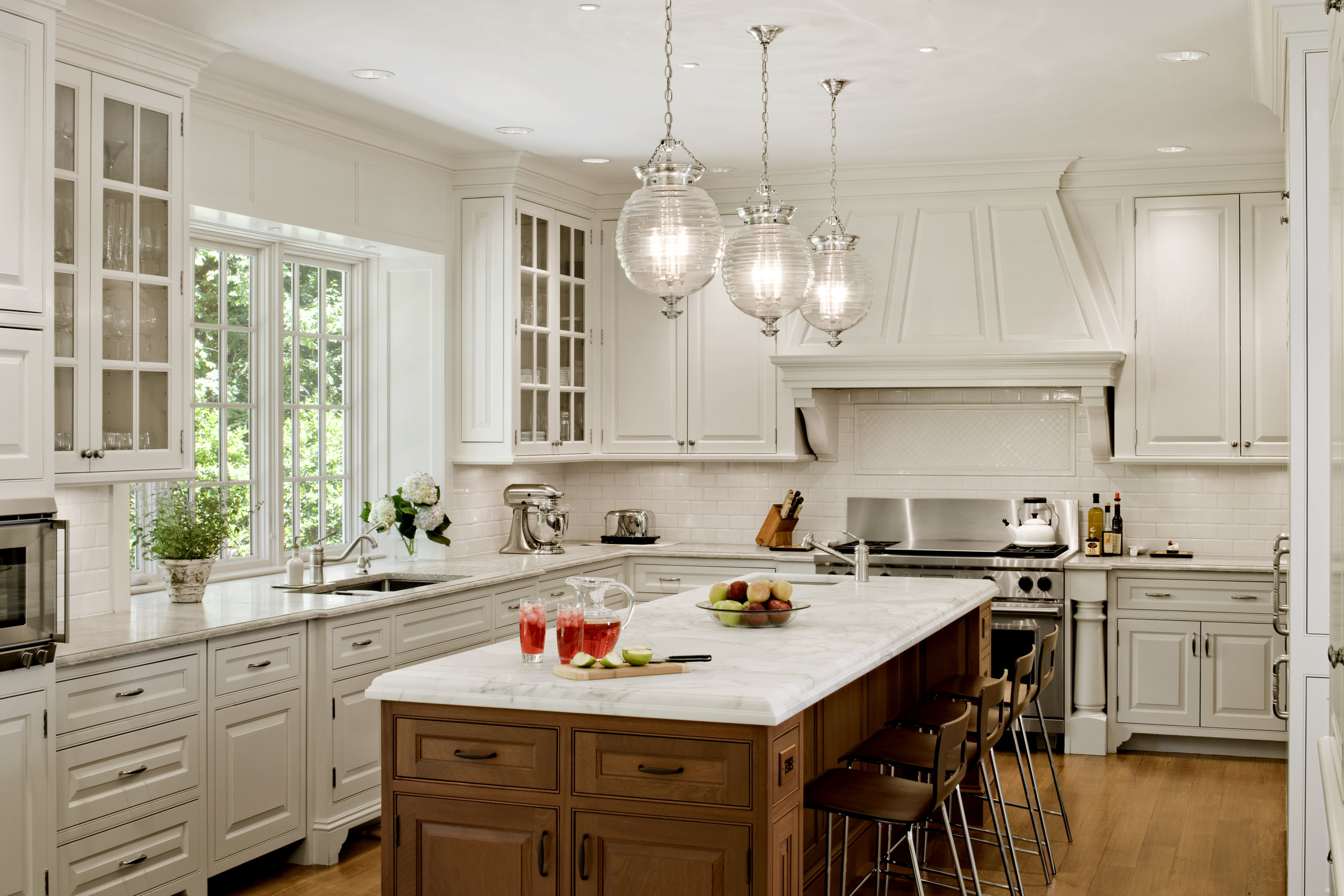
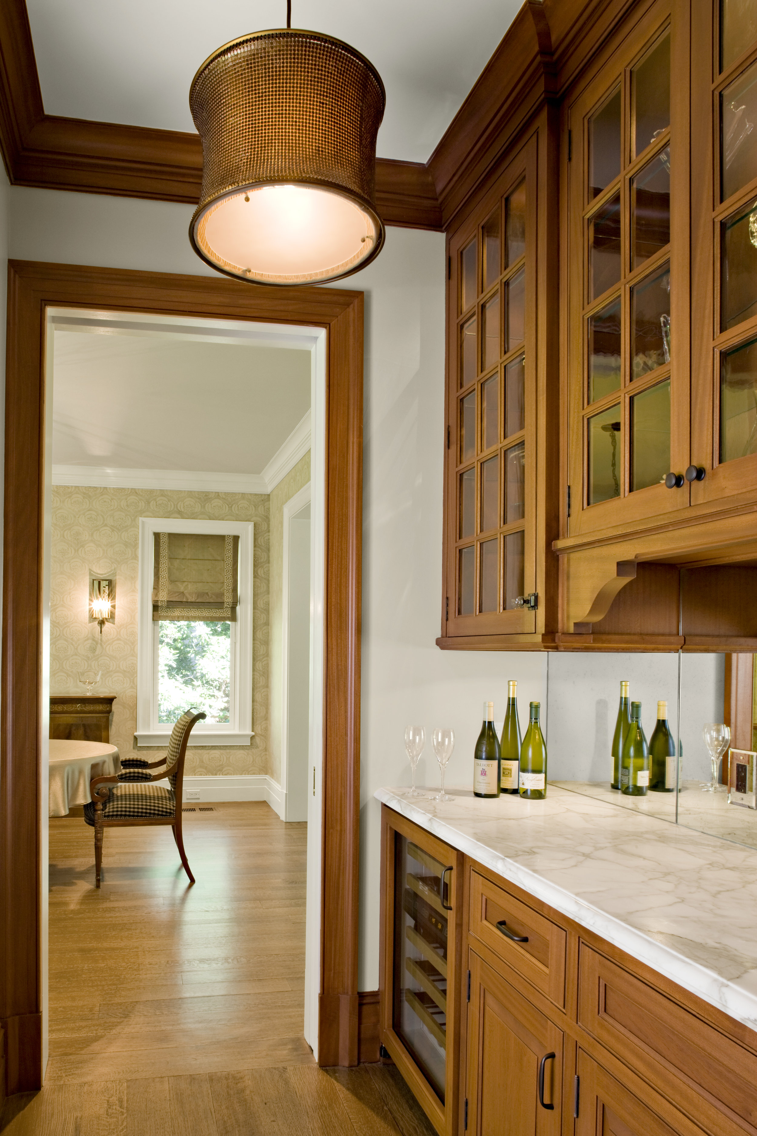
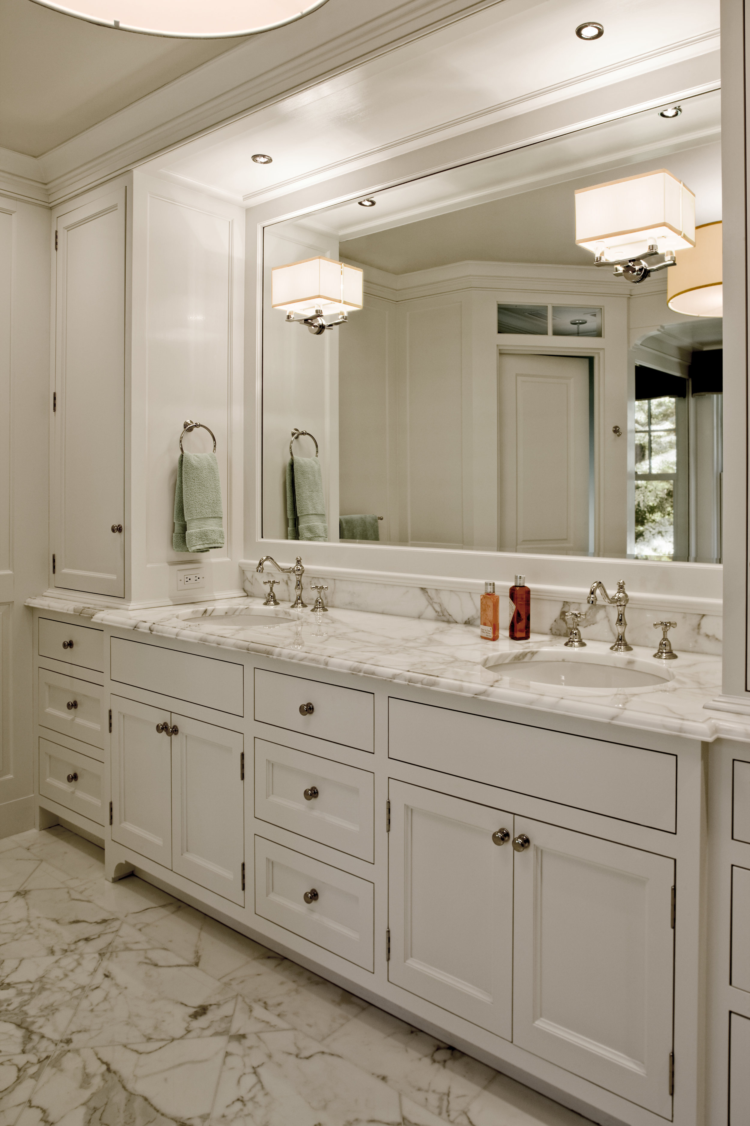
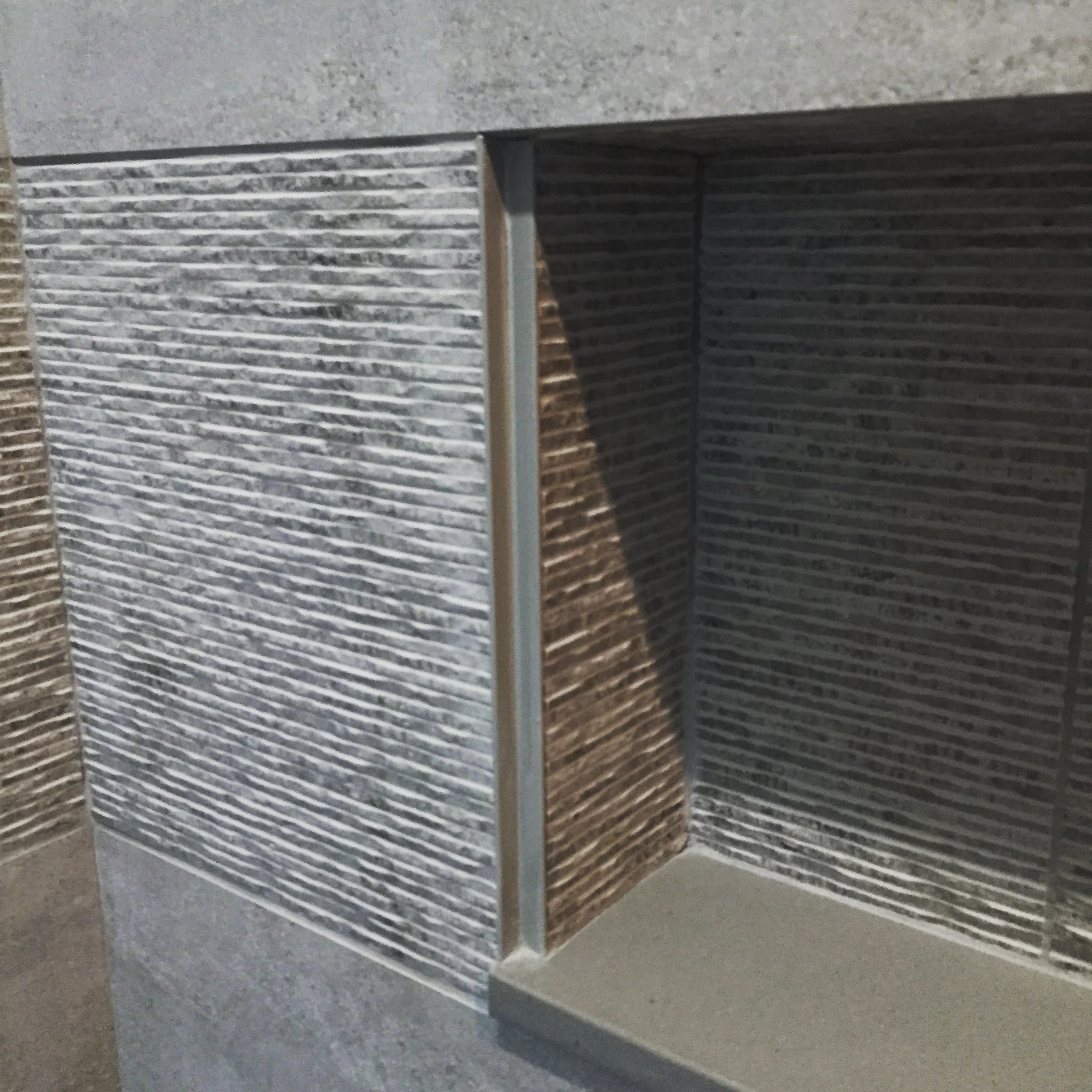
3. Mastery of Proportion and Detail
At the highest level, architecture is subtle.
The width of a hallway.
The height of a ceiling transition.
The projection of an eave (roof overhang).
The size of a crown moulding assembly.
These decisions are often measured in inches—or fractions of inches. But they dramatically affect how a home feels.
Refinement takes hours of study and adjustment. The difference between “beautiful” and “extraordinary” is often invisible to the untrained eye—but unmistakable in experience.
This is why many people love certain homes and spaces, but cannot articulate why.
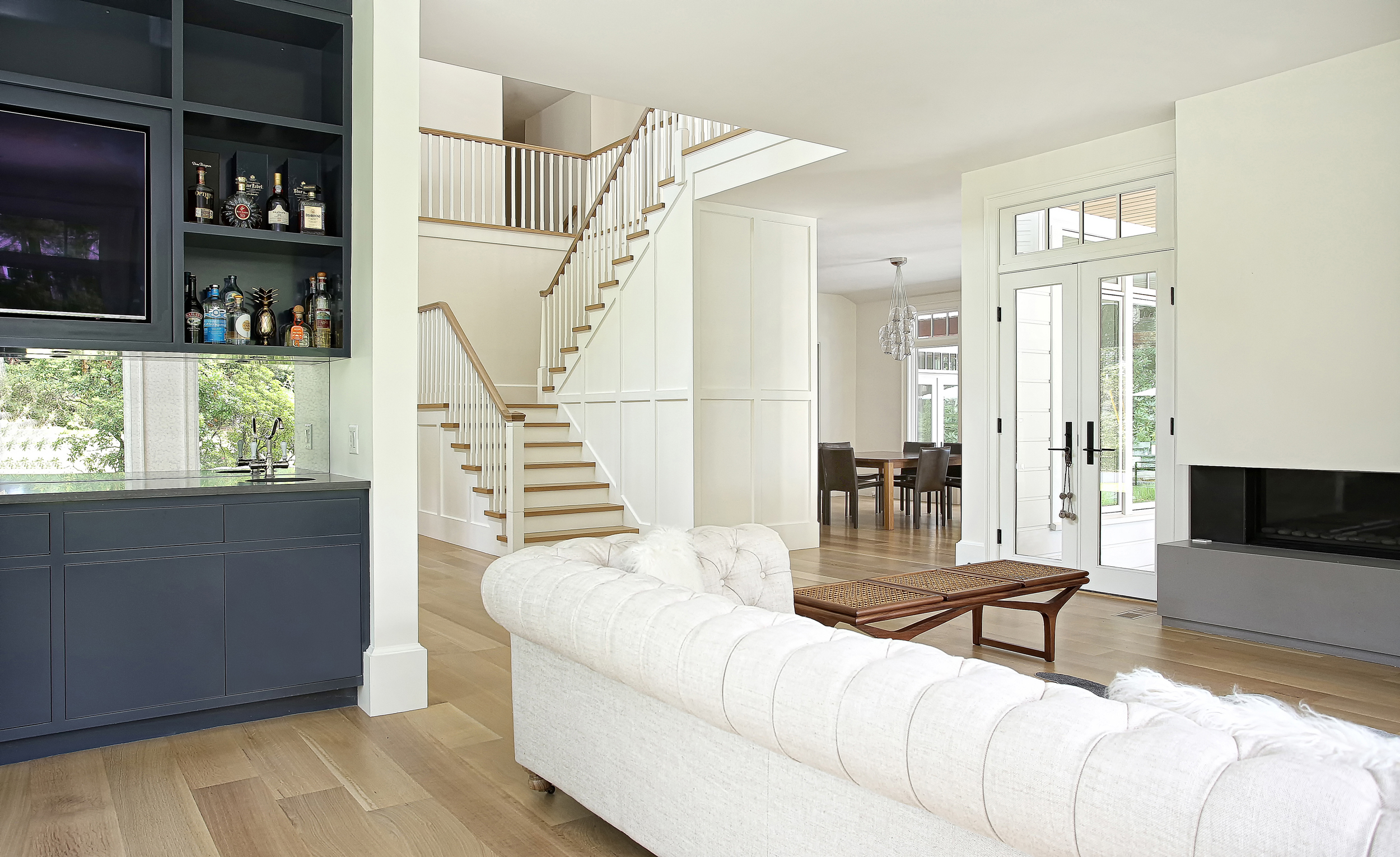
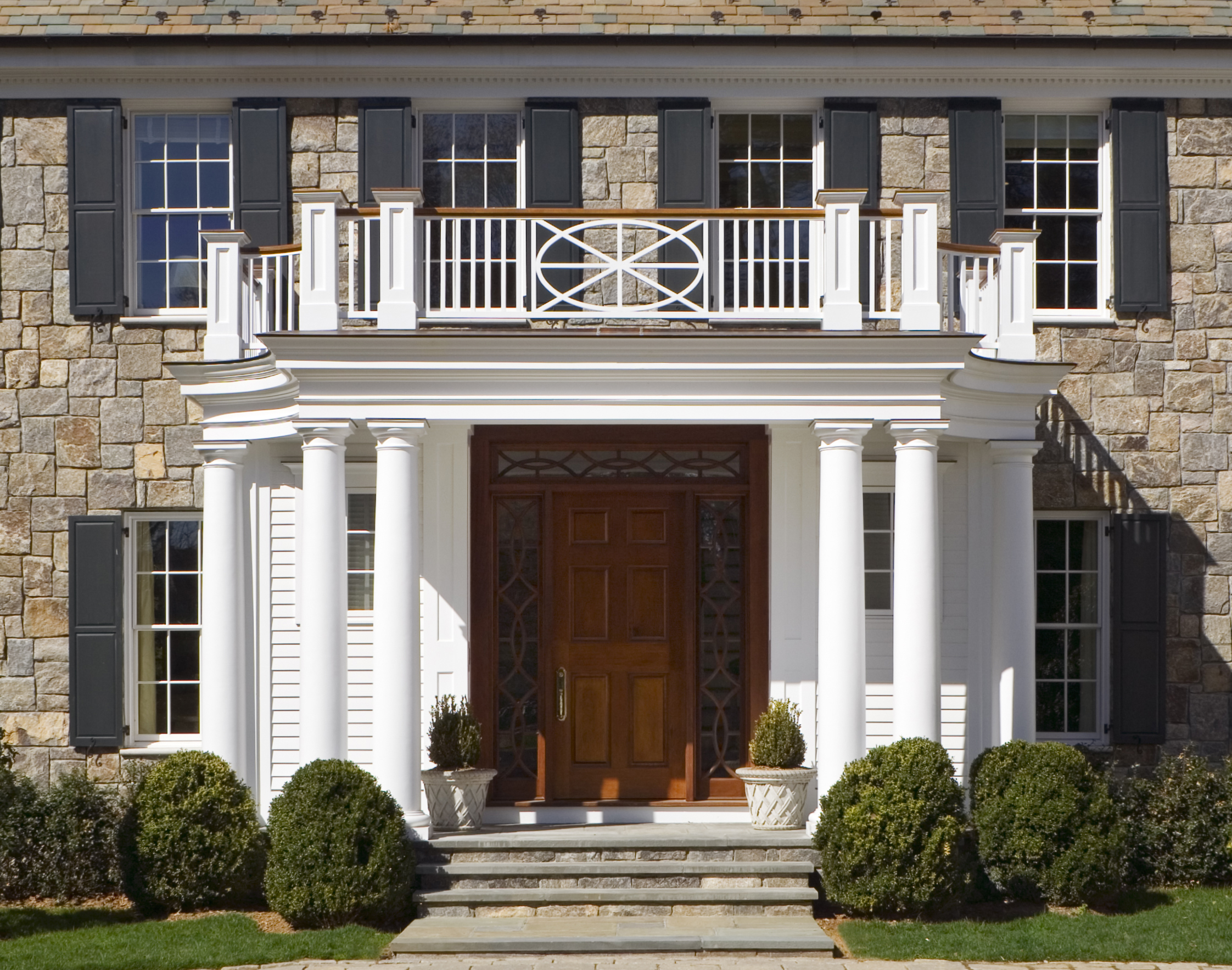
4. Access to Exceptional Materials and Craftspeople
Luxury design opens the door to artisans and suppliers who operate at an entirely different level of quality.
Custom-milled hardwoods.
Hand-finished plaster.
Book-matched stone slabs.
Bespoke metalwork.
Furniture designed specifically for your spaces.
We do not simply specify materials—we curate them. We visit stone yards. We review millwork shop drawings in detail. We continually meet with suppliers and fabricators to learn about their latest products and capabilities. We collaborate directly with fabricators to ensure execution matches intent.
You are paying for craftsmanship that cannot be mass-produced.
5. Integration of Complex Systems
Today’s high-end homes are extraordinarily sophisticated. Discreet climate control systems. Advanced lighting design. Whole-home automation. Wellness technologies. Energy efficiency strategies. Acoustic engineering. Specialty kitchens. Wine rooms. Home theaters. Golf simulators. Outdoor entertaining spaces. Etc. etc. etc.
Each system must perform as intended—and integrate seamlessly into the architecture.
When properly designed, you don’t notice the infrastructure. The home simply works.
That invisible sophistication is the result of careful coordination among engineers, consultants, contractors, and specialists.
You are paying for us to coordinate these many moving parts and technologies that seem to change every year.
6. Risk Management and Financial Protection
A custom residence represents a significant investment. Missteps during design or construction can be extraordinarily costly.
Comprehensive documentation, detailed specifications, and proactive coordination reduce change orders, limit misunderstandings, and protect the construction schedule. We always say that it is a lot cheaper to figure something out on paper and very expensive to figure it out during construction - in real time, with real materials and real labor costs.
We advocate for our clients throughout the process—reviewing bids, evaluating value engineering proposals, and maintaining design integrity during construction.
After all, when comparing the cost of Architectural Services from one firm to another, it is the value that you create in your home upon completion that will far exceed the fees paid. A 2x6 costs the same regardless of who draws it, but if we can limit costly change orders during construction, provide a product with significantly higher resale value and a higher emotional connection to you and your family - that is more than worth the investment. Nothing is more expensive than a cheap Architect.
You are paying for protection—of both your budget and your long-term asset.
7. Long-Term Value
While luxury design may carry a higher upfront cost, it often proves financially prudent over time.
Timeless architecture retains value.
High-quality materials age gracefully.
Well-built homes require fewer repairs.
Thoughtful planning prevents expensive renovations later.
More importantly, a home that functions beautifully enhances daily life in ways that are difficult to quantify.
You are paying for durability—both emotional and financial.
8. The Intangible: How It Feels
There is a moment in every completed home when the design fully reveals itself. The light enters as intended. The materials harmonize. The proportions feel deliberate and “right”.
That sense of quiet confidence is the true hallmark of luxury.
It cannot be purchased off the shelf. It must be designed, refined, and built with intention.
In conclusion. . .
You are paying for:
Expertise that prevents costly errors
A deeply personalized design process
Precision at every scale
Exceptional craftsmanship
Invisible technical sophistication
Long-term performance
Enduring beauty
Above all, you are investing in a home that will support your life—not just shelter it. And choosing an Architect to collaborate with you on the design of your home based on the lowest cost is not a recipe for success.